Responsive Web Design
If you had your website developed 8 years or so ago, the chances are that your site is not responsive. So what is all the fuss about? What is a responsive website and why is it important that your site is responsive?
What is Responsive Web Design?
Simply put, a responsive website “responds” to the visitor's needs based on their available screen size and screen orientation. More simply put, your website will be functional on any device including desktops, laptops, tablets, phablets, and mobile phones. It will also adjust depending on how the visitor is holding that device. I.e., in landscape or portrait orientation. The site will then adjust its layout to suit that specific device which in turn will make the browsing experience more effective and less frustrating.
We all have looked up a site on our mobile phones only to find that the site was not responsive. This mend that the site simply shrunk down to a miniature version of itself. This is very frustrating for the visitor because 1- you can’t read any text unless you zoom in but even then you can only see a very small part of what you want to read, and 2- you can’t navigate the site because your fingers are too big for the tiny menu buttons.
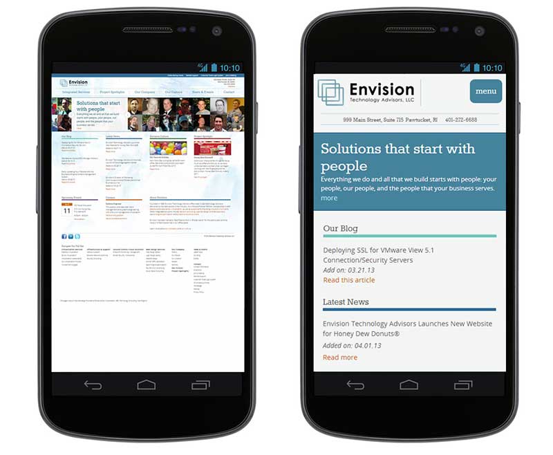
If you look at the below sample, you can see a site on the left that was not responsive and the site after it was made responsive. The first difference you noticed is that on a mobile device, the layout of the site changed. For example, the tiny logo is made more prominent so you can see which website it is. More importantly, the extremely small menu on the very top right is now a button. Pressing the button will reveal the menu and its sub-menus across the full screen. So plenty of space to click on menu items with your finger. Another important thing you notice is that the actual content, the articles, are now placed underneath each other and are sized so you can easily read them without scrolling or resizing your screen. Any scrolling you do need to do is vertical…
How can I test a site to see its responsiveness?
The simplest way to check the responsive layout of a website is to simply open it up in your browser on your desktop. After the site loads, you can resize your browser window by left-clicking on the extreme bottom-right corner of the browser window and then dragging that corner to change the size.
Alternatively, you can download an App for Google Chrome that will simply let you pick from a predefined list of mobile devices and then render the site as if you were browsing the site on that device. You can install the “Mobile/Responsive Web Design Tester” by following this link.
If you use Firefox as your browser, you can simply press Ctrl + Shift + M. If you are using Internet Explorer you should simply stop using it and install Chrome.
Why should my site be responsive?
Other than the obvious fact that you can barely use a non-responsive site on a mobile device, here are some reasons why it is time to make the change…
- Don’t lose your customers to your competition. If your potential customer can’t use your site then you need not be surprised if he or she just presses the “back” button and clicks on the next Google search result. Cater to your clientele by being “responsive” to their needs.
- In 2022, almost 85% of ALL Internet users will access the Net on a mobile device. This means that if you are happy to disregard 85% of the market then there is no issue. However, if you want to tap into that additional 85%, you need to offer a responsive website.
- Google loves rich and unique content. However, it hates it when it is not offered responsively. Your Google ranking will be negatively affected if your site is not responsive.
- Client perception should be important to you. If clients see that your website is stuck in the 2000s then they may extrapolate some negative assumptions about your goods and services as well. A modern website on the other hand will give your customers a positive perception of what you do…
If you would like to have a look at a range of responsive design websites then you can do this now… Just follow this link – responsive website samples – and you can try our fully functional responsive design websites and see the responsiveness for yourself by resizing your browser’s window.
We can get one of these fully customized installed for less than you think. See our MONTHLY SPECIAL...
